Pocket Properties
Summary
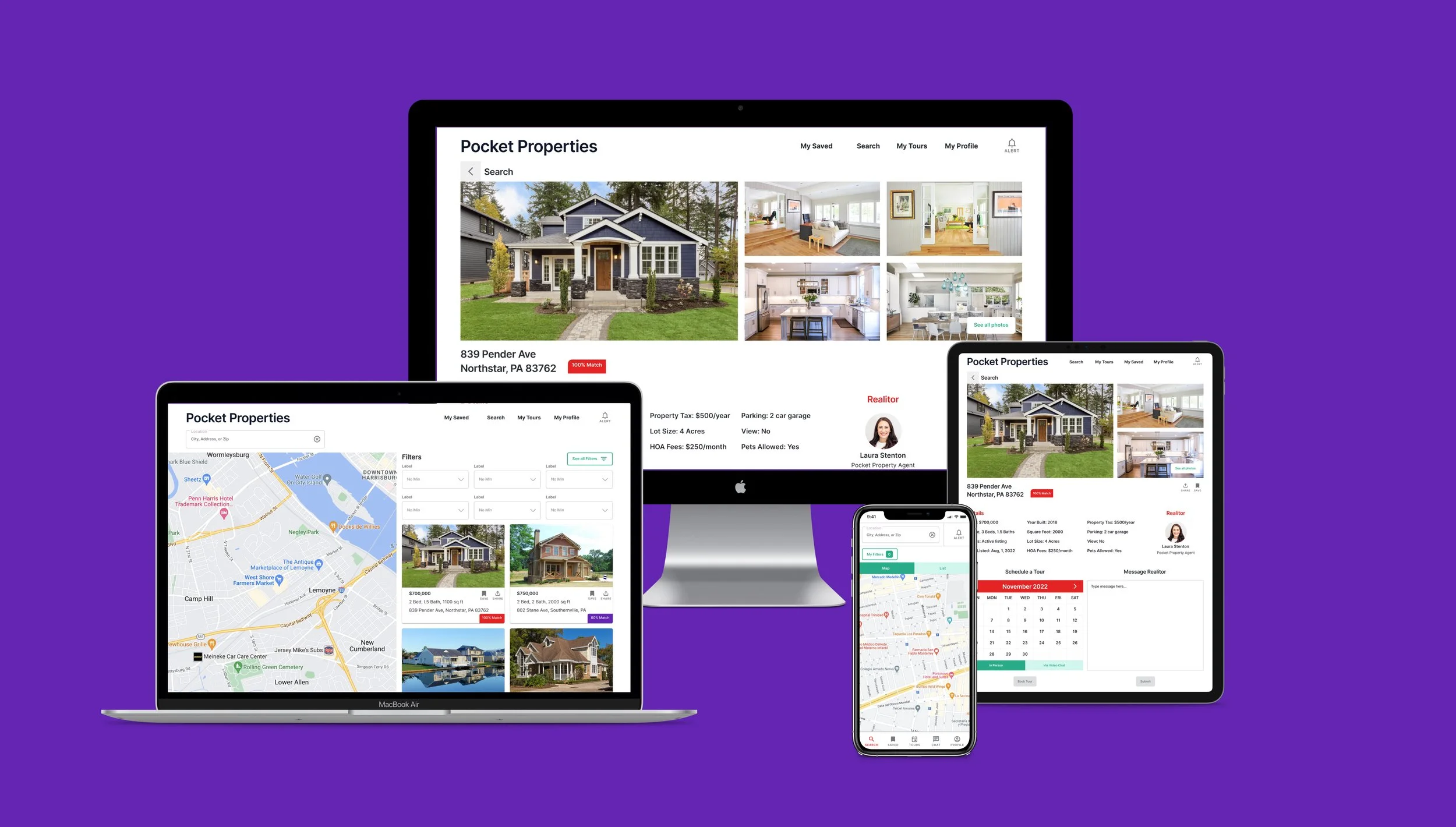
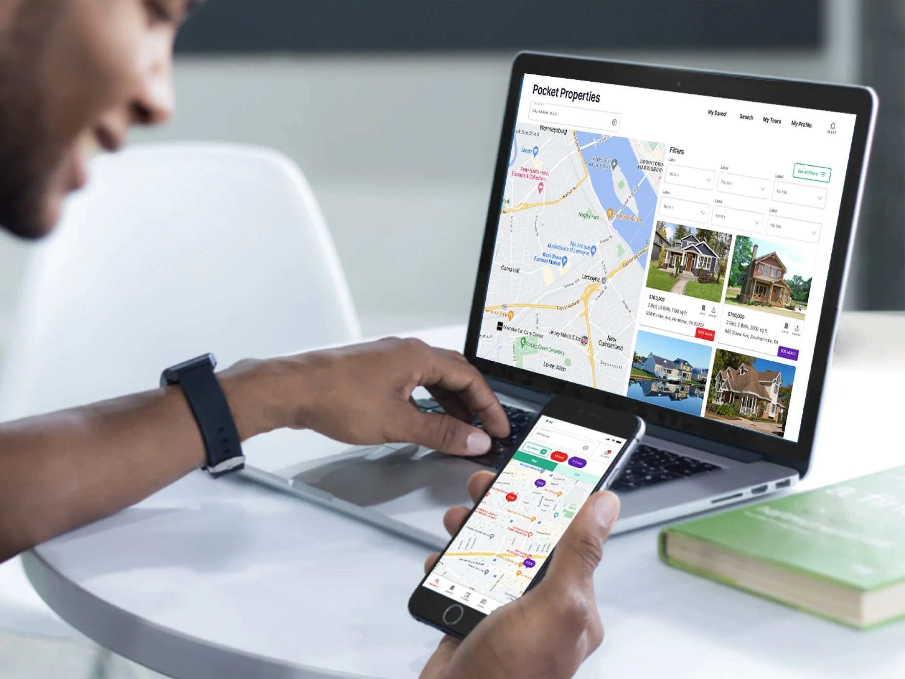
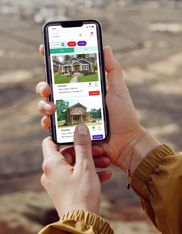
Pocket Properties is a responsive web app designed to help unseasoned property owners find real estate to invest in.
Timeline
3 Months
My Role
UX/UI Design
Tools
Figma / Adobe Photoshop
Design Thinking Process
Empathize - Review Business Requirements / User Research / Problem Statement / Competitive Analysis
Define - User Personas / User Journeys
Information Architecture - User Flows / Site Map
Prototype - Wireframes / Prototypes
Testing - User Testing
Visual Design - Design System / Branding
Handoff
Problem Statement
Unseasoned buyers need access to reliable, uncomplicated information about their potential property investments. Buyers need a way to get a feel for a place by viewing comprehensive information about the property and its neighborhood before spending time on-site.
Who are the users and what do they want?
Who Primarily for new, small-scale property buyers who are looking to invest for additional income or financial security.
What User-friendly, responsive web app containing a database of available residential properties and land, and comprehensive information on each listing.
How and When Buyers will use this tool when conducting property searches, and making a decision about where to invest.
Where Buyers will use this tool at home or on the go. Users can search for properties anywhere, as long as they’re logged in on a device.
Business Requirements
The below features/business requirements needed to be addressed on the responsive web app.
Search and filter available properties
Bookmark favorite property listings
Property recommendations
Ability to contact real estate professional when wanting to move forward with a property (i.e., guided viewing, ready to invest).
Competitive Research
The two direct competitors that I looked at before starting any designs were: Redfin and Zillow.
They were similar in the fact that they allowed for a user to input their search criteria when looking for properties. They both showed listings on a map and in a list view. They both allowed for saving and sharing listings. Also, they both showed properties for sale and for rent. I wanted Pocket Properties to have some of their important features but also wanted the ability to compare properties based on search criteria and allow users to receive notifications when properties came on the market that were within a %70 match to their search results. Pocket Properties does not show properties to rent so it also differs from these competitors in this way.
Persona
After reviewing the initial user research, I created a primary persona who represents a target customer for Pocket Properties. This was helpful because it gave me someone to design for and helped me empathize more with the potential users of the app.
Name: Rashida
Age: 42 years old
Status: Married, 2 children
Occupation: IT consultant for a growing tech company.
Location: Redmond, WA
About:
Rashida is frequently on the go, and often holds meetings by phone in her car while driving. She is good at multitasking and relies heavily on technology to help her with this.
Hobbies:
Loves relaxing at the park with her family, enjoys her annual vacation with long time girlfriends, loves reading.
Pain Points:
• Feels anxious to start investing in something tangible and not just the stock market while she is still young.
• Is starting to worry that her family is pouring a lot of money into rent and will never own their own place.
• Doesn’t know how to find available homes or property to buy or what she needs to do to get started.
Motivations:
• Wants to invest in property beyond the city for increased financial security for her family.
• Wants a property to be able to live in during retirement after it is completely paid off either by her family or by renters.
Needs:
• She wants to find the right information about real estate for fast decision-making.
• She wants a tool to help her find properties that match her criteria so as not to waste her time.
• Needs a way to contact a real estate agent to get answers from a real person.
Rashida’s User Journey
To understand a user like Rashida better I mapped out how her journey might look if she were to complete the task of sending a message to a real estate agent to get more information on a house she is interested in. Creating user journeys is a very helpful tool to understand a user’s emotions as they complete tasks and are helpful ways to find opportunities to eliminate pain points.
User Flows
Information Architecture / Site Map
After figuring out what features would be needed on Pocket Properties by looking at the business requirements and the user needs I created a site map. This site map helped me decide where features should be located on the app. I reviewed the site map with three potential users and created a few iterations until creating a version that everyone easily understood.
Wireframes and Prototypes
After organizing where the screens should live within the app, paper wireframes were quickly sketched out. Hand sketched wireframes were done first because that was the fastest way to start visualizing concepts and then I blocked out in Figma using grayscale. This stage was purely to figure out page layouts in the fastest and least expensive way possible.
Low Fidelity Wireframes
User Flow 1: Input Search Filters / Schedule Viewing
Mid-Fidelity Wireframes
User Flow 1: Input Search Filters / Schedule Viewing
User Testing - Mid Fidelity Screens
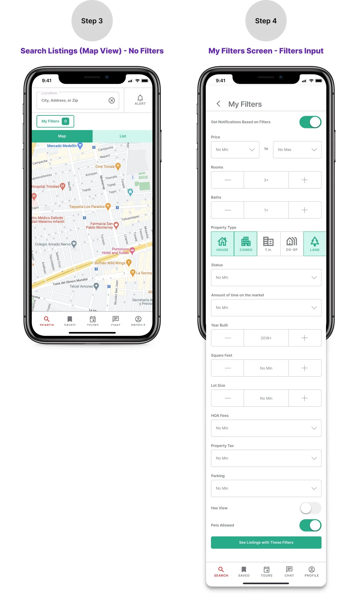
After mid fidelity screens were designed I ran a user test to see how easy it was for users to complete the task of putting in filters to the app, selecting a listing to review and locating where to go to message a real estate agent.
UI Inspiration
Mood Board
Before beginning on the designs for the final, high fidelity screens I created a mood board consisting of colors, motifs and imagery that were trending on Pinterest when searching terms like “Real estate” and “First time home owner”. This helped me select colors, motifs and imagery that would appeal to the target market.
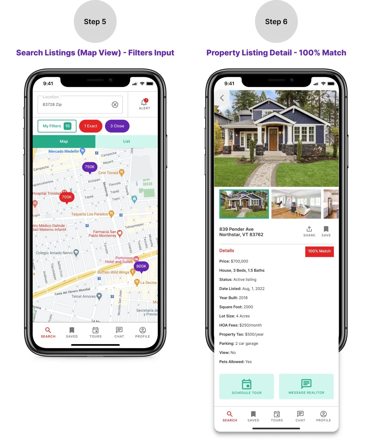
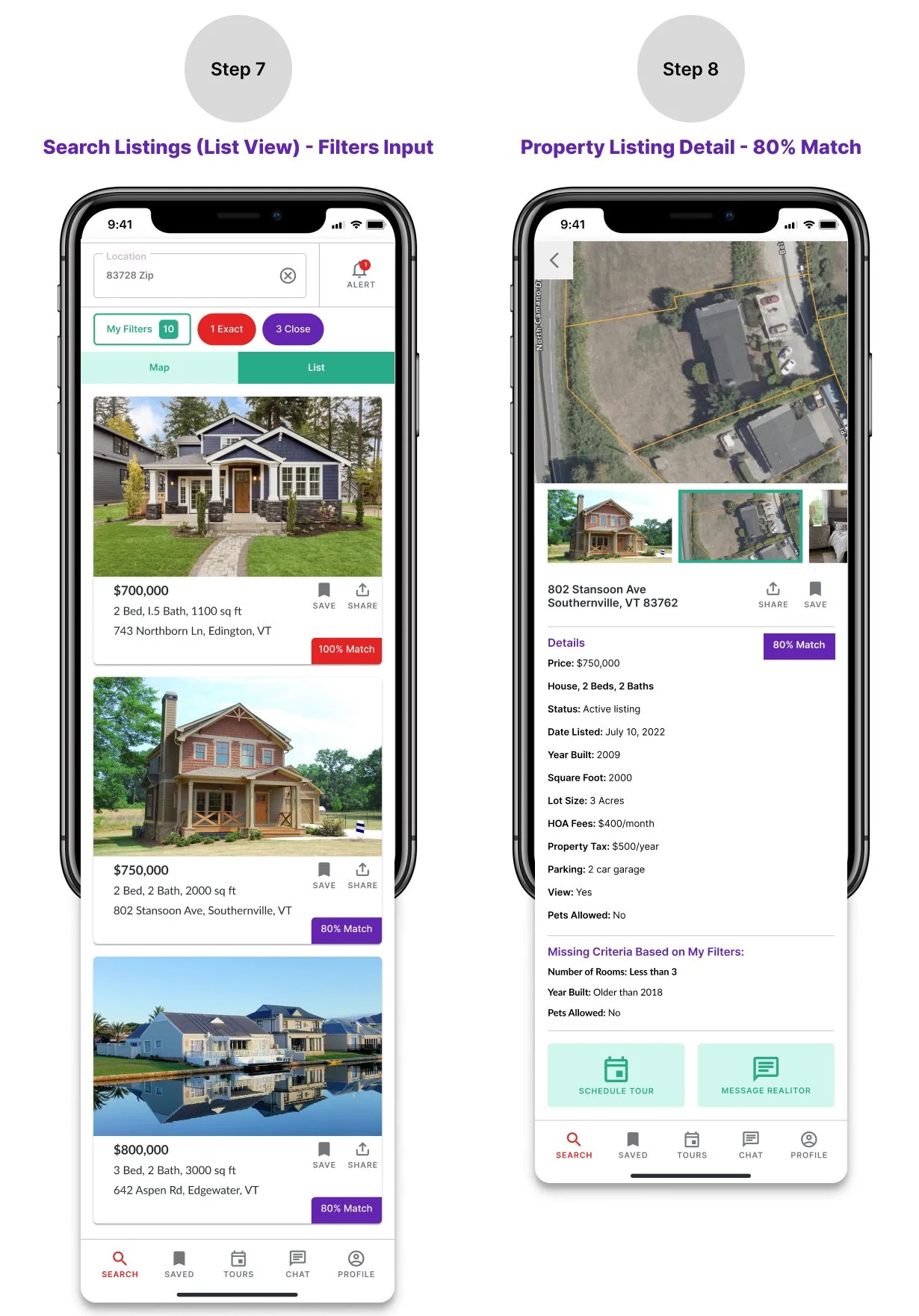
High Fidelity Mobile Screens
User Flow - Sign Up and View Listings
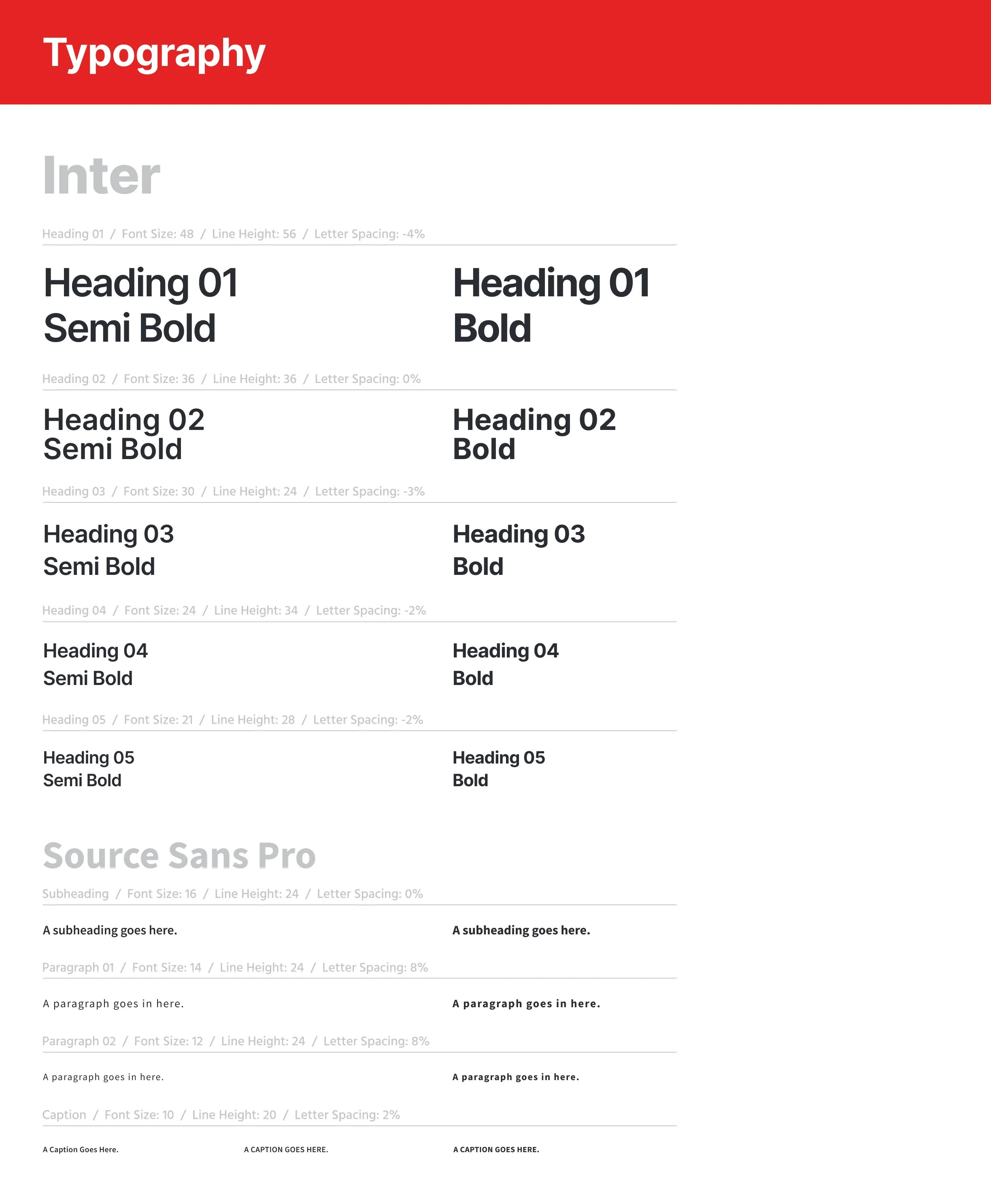
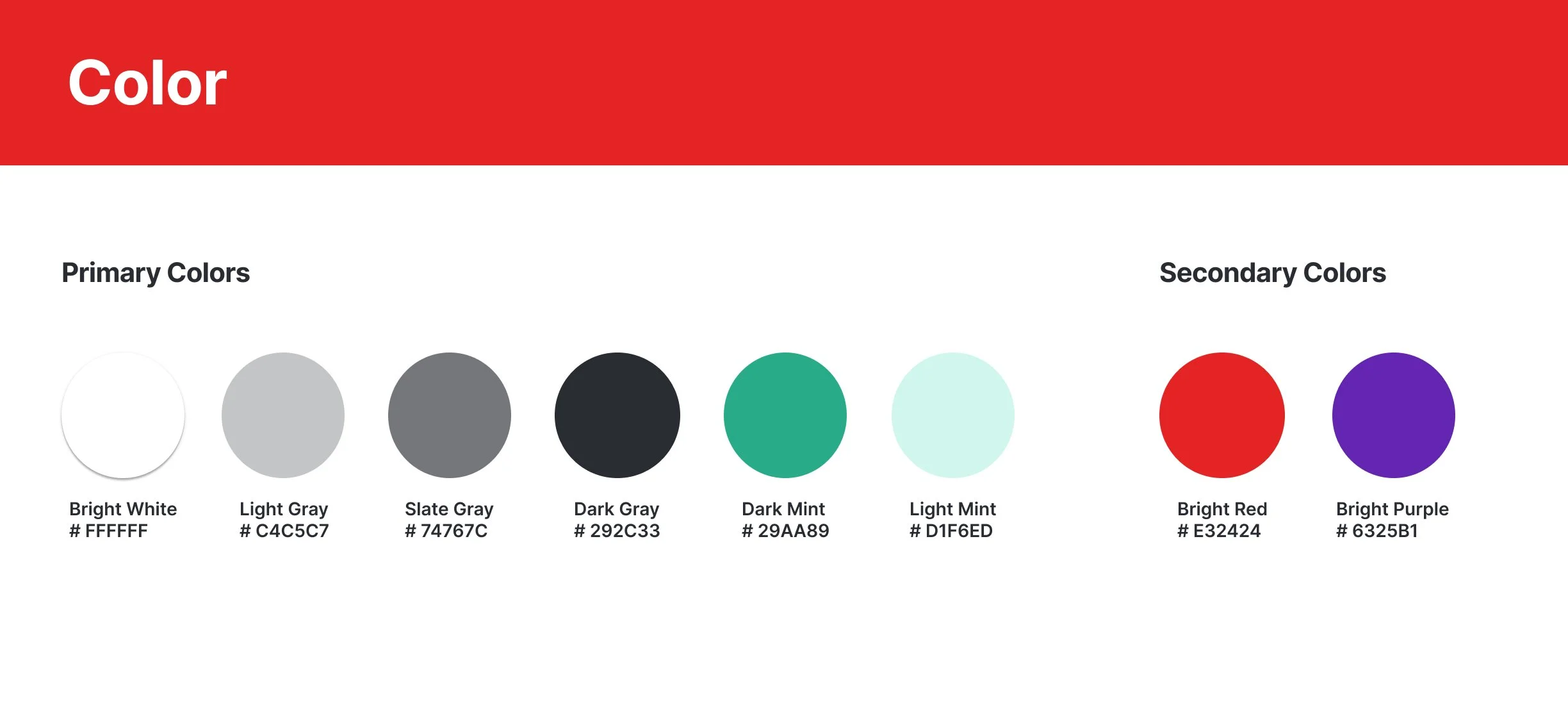
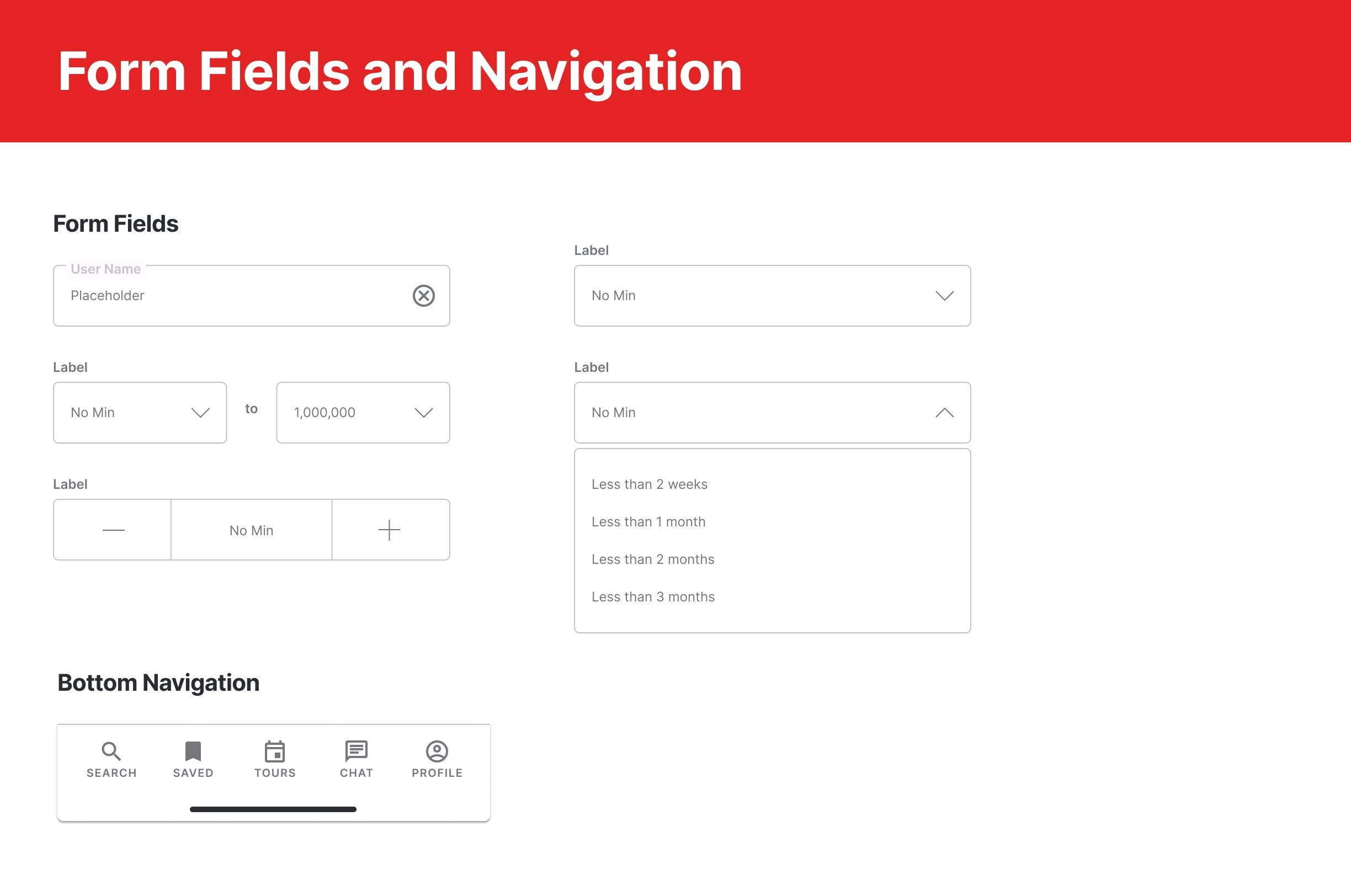
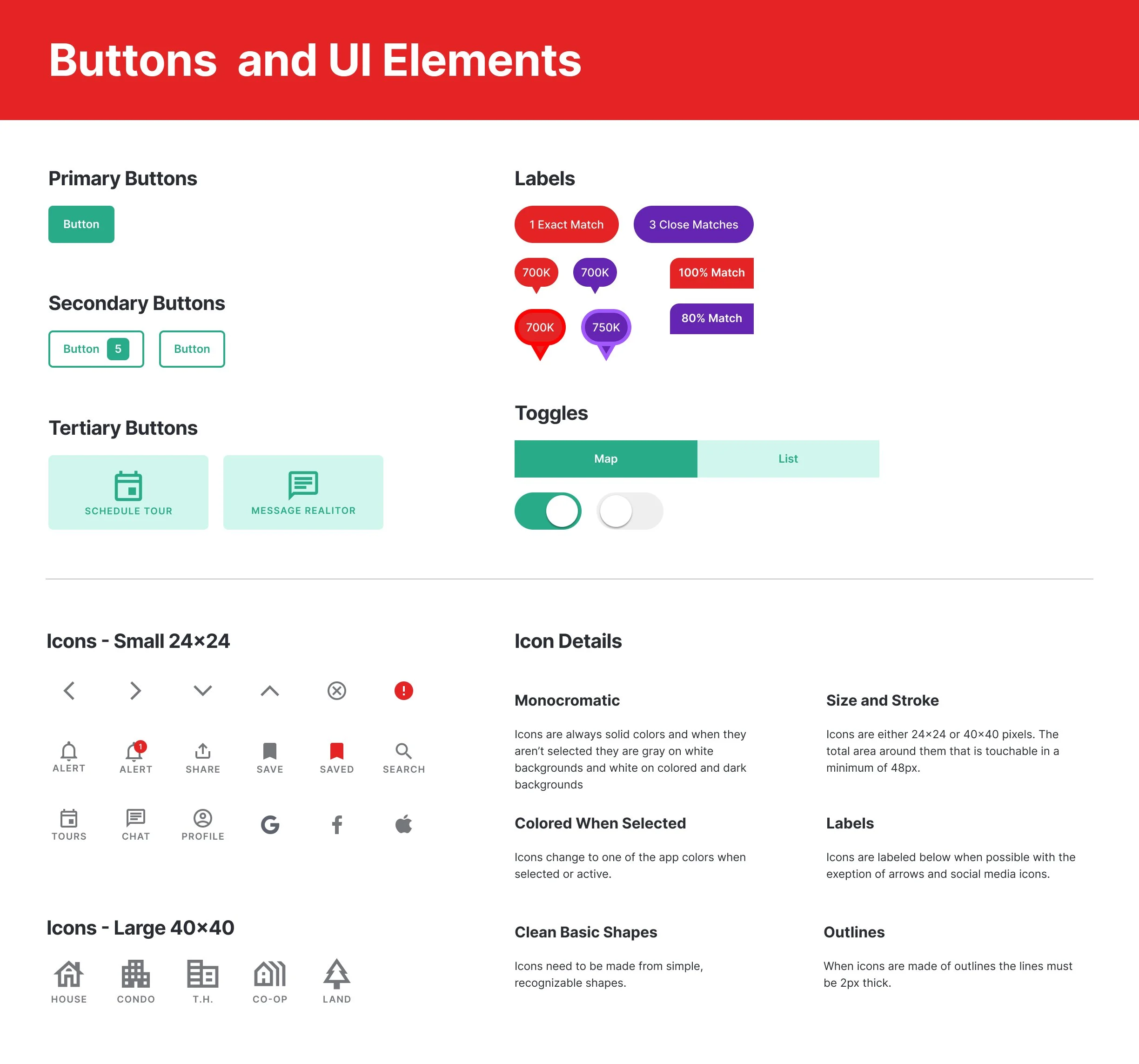
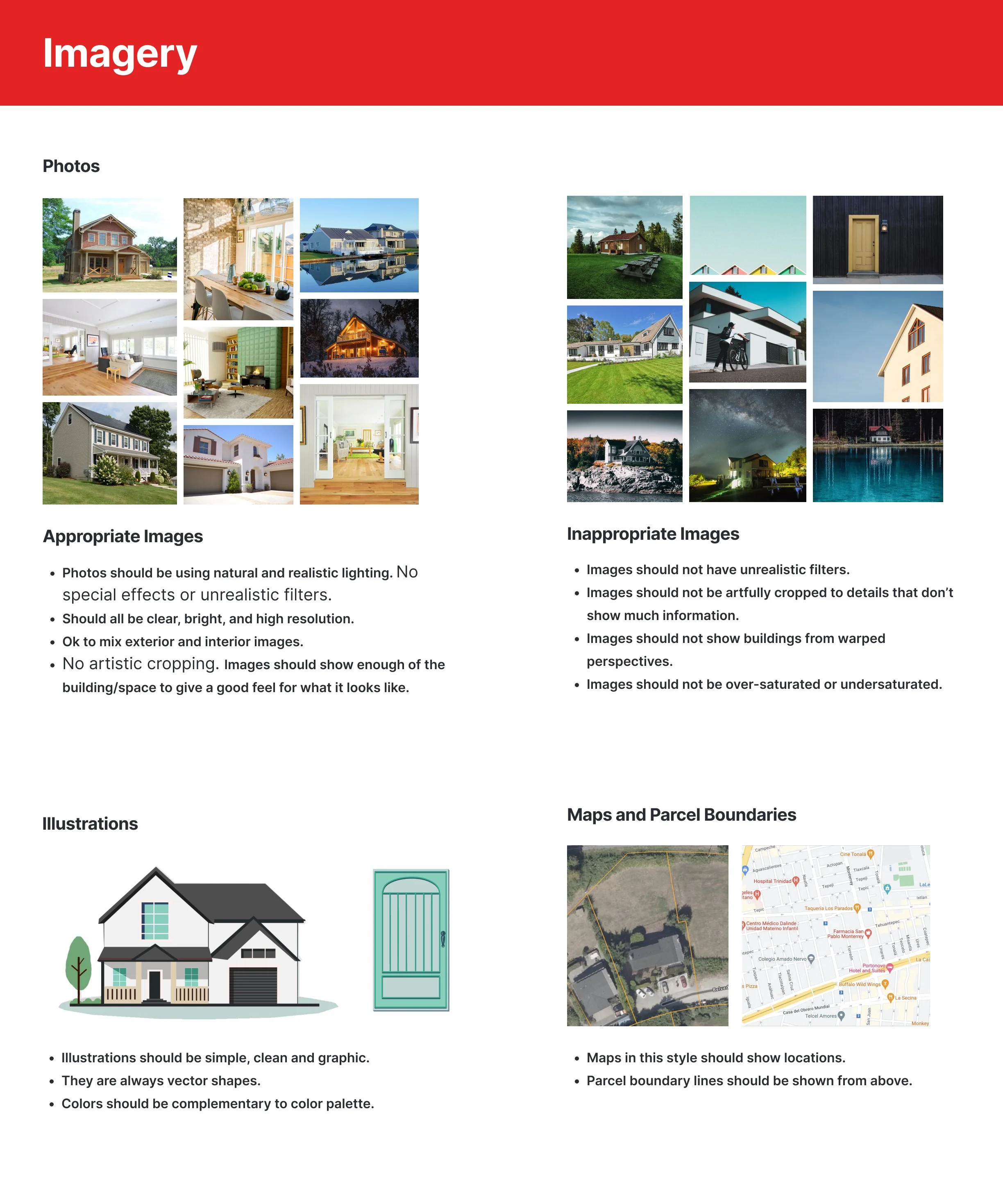
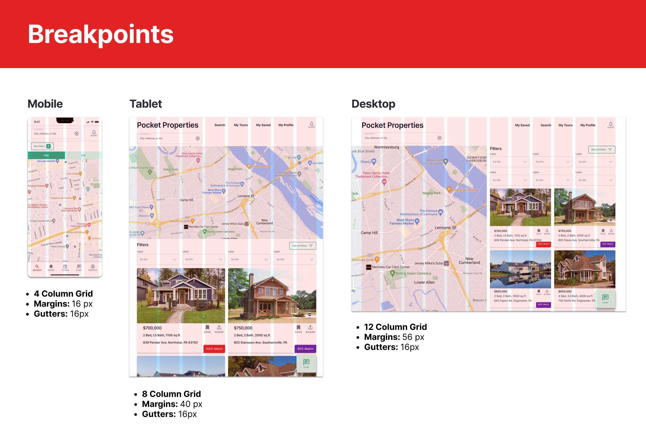
Style Guide
Retrospective
Pocket Properties has been well received by users that have interacted with it and I’m happy with how it turned out.
One of the biggest challenges I faced during this project was to make Pocket Properties look different from Zillow and Redfin. Both of these competitors offer similar features and include listings in a map view and a list view.
My solution was to make sure my color palette was very different from the other two platforms. I used colors that were trending in online searches for “first time home owners” and “real estate”. As a result I think my design is more youthful and playful than Zillow and Redfin, while still being professional and trustworthy. Pocket Properties also offers some different features than the other two provide such as the ability to compare listings based on search criteria and get alerts when new listings arrive that match search criteria.
With more time I would continue to develop the other features of this app including Saved, My Tours, Chat, and Profile. I would like to do user testing with every new design I put together before refining my final design for handing off to the developers.

