Plantly
Summary
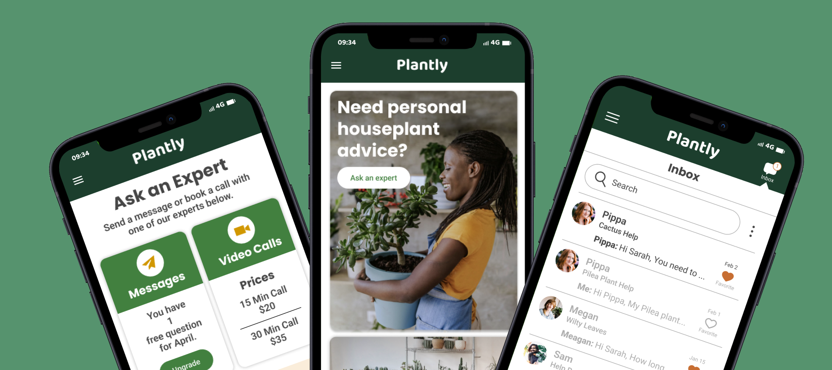
Plantly is a responsive web app designed to connect houseplant owners with expert advice on houseplant care and topics related to houseplants. It is designed for people that would like personal advice on their specific plant issues as well as tips, tricks and inspiration for having healthy house plants in their homes.
Timeline
6 Months
My Role
Solo Project: UX Research / UX Design / UI Design / Illustration
Tools
Figma / Adobe Illustrator / Adobe Photoshop
Google Form / Usability Hub
Design Thinking Process
Empathize - Hypothesize / Business Requirements / User Research / Competitive Analysis
Define - Problem Statement / User Personas / User Journeys
Information Architecture - User Flows / Site Map
Prototype - Wireframes / Prototypes
Testing - User Testing
Visual Design - Design System / Branding
Handoff
Problem Statement
It can be difficult for people growing indoor houseplants to get personalized help for their specific houseplant issues. Most information on-line is too generic to be helpful, leaving houseplant owners to solve problems through trial and error. It can also be difficult to know what information to trust on-line. With that in mind my main challenge was to create a trustworthy place where people can find expert advice for their houseplants.
Business Requirements
The below features/business requirements needed to be addressed on the responsive web app.
An onboarding page (a screen or screens that show the user the basics of getting started).
A way to sign up and log in that allows users to input and save their personal information.
A home screen or dashboard where users can access their information.
A menu that allows users to navigate the application.
A way to browse experts and pose a question to them.
A way of paying for an expert’s time.
User Research Goals
A series of 5 user interviews and a survey with 45 participants was conducted to learn about the needs and behaviors of the target users for Plantly. The four main research goals were:
What do indoor houseplant owners need help with on their journey to successfully growing their plants?
What features might users want to use on an app providing expert advice on houseplants?
How and When would users best communicate with an expert through an app?
Where do they currently go to find information on houseplant care and inspiration?
Survey
After defining the main research goals, I created a survey with Google Forms to send out to a wide range of potential users. I felt that a survey would provide a lot of data to help direct design decisions and learn about potential Plantly users in a quick, efficient, and inexpensive way because it is easier for people to fill out a quick survey than do an interview. I could also get data that included edge cases.
My survey consisted of:
Age Range: 25 - 65 years old
70% Women, 30% Men
Most participants owned indoor houseplants.
Survey Highlights
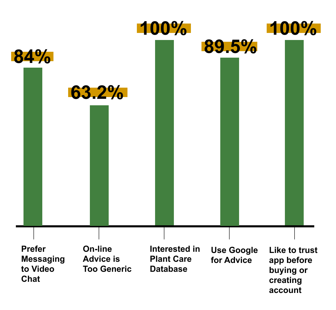
84% preferred a message feature to a call feature. But there was interested in a video chat option if problem was more complex.
Issues with bugs, disease, lighting, and not knowing what plants were best for their space were primary plant related problems.
100% wanted a plant care database with information for quick reference.
89.5% use Google for houseplant care advice. 57.9% ask friends and family.
63.2% said the biggest concern with on-line advice was that it is too generic and not specific to individual needs.
100% like to build trust with an app before paying and creating an account.
User Interviews
Along with a survey I also conducted user interviews. These interviews provided me with the chance to get more in-depth information from the users and ask follow up question to figure out why they felt the way they did. Studies have shown that you can get the bulk of information you need by interviewing 5 people so I focussed on 5 target users. All interviews were done over video chat and were 30 and 45 minutes.
Who are the interviewees?
5 women between 25 - 38 years old.
Own indoor houseplants and care a lot about keeping them healthy.
Comfortable using mobile apps and the internet to gather information.
Interview Highlights
100% wanted to be able to message an expert for flexibility. They liked being able to send a message anytime and not have to plan time for a call. Some also felt awkward about video chatting with a stranger.
90% wanted the option to video call if their problem was more complex and felt that a human face over video would build trust.
90% of people’s biggest problems with owning house plants were bugs, disease, lighting, and not knowing what plants were best for their space.
100% use Google to try and solve problems right now and they all struggle with how broad and non specific the advice was to their particular needs.
100% thought they would use the following features: plant database with care information, articles on plant care/inspiration, and online classes on plant care.
Competitive Research
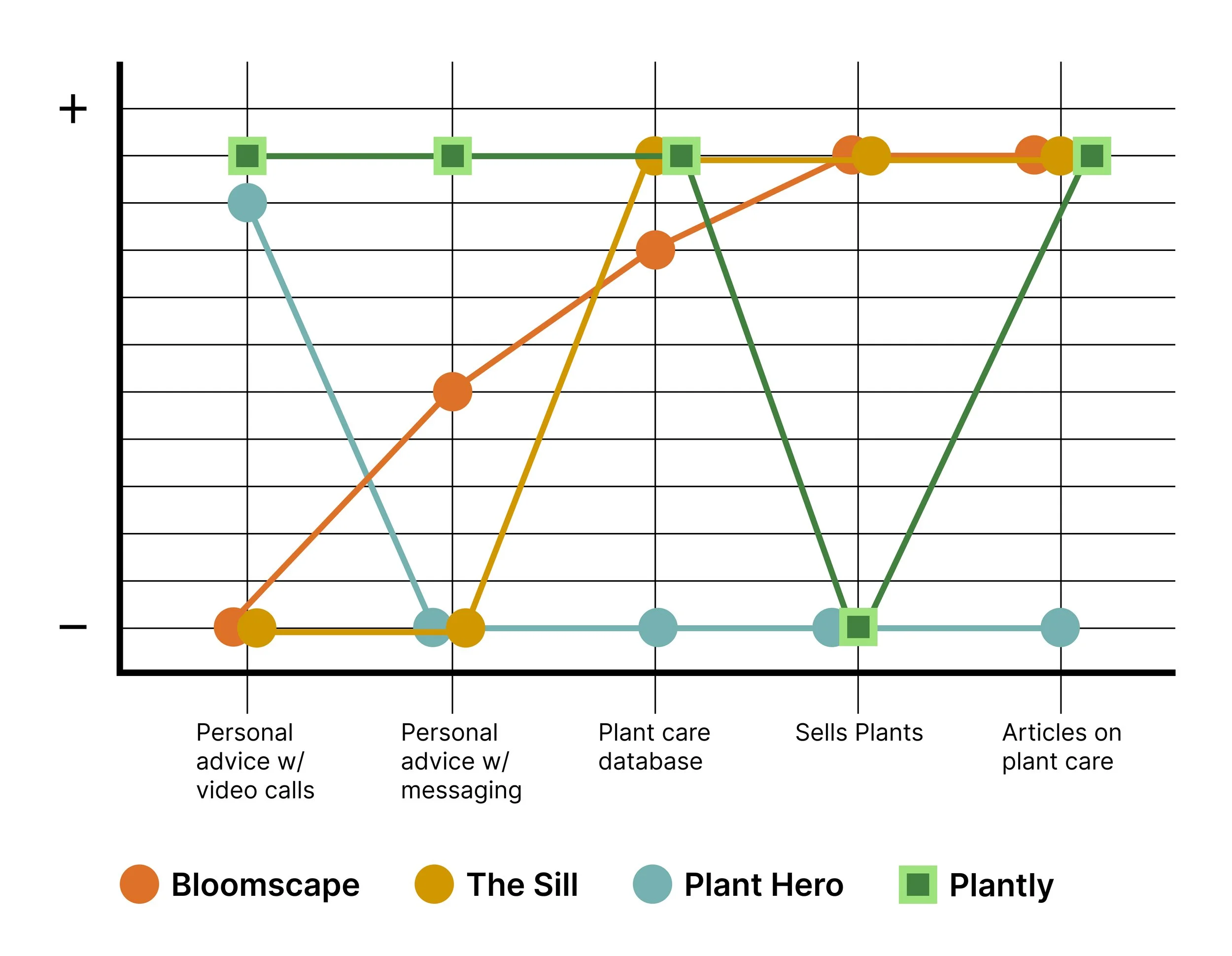
I noticed 3 direct competitors in My research: Bloomscape, The Sill, and Plant Hero.
All of them had clean and functional responsive web apps but there were areas in which they differed. For example, Bloomscape and The Sill were primarily focussed on the business of selling plants but had information about plant care incorporated in their business model. Plant Hero only offered video calls with plant experts. I wanted to incorporate the best features of the three apps into Plantly without selling plants.
Personas
After completing my initial research I created a few primary personas who represented the range of users that might use Plantly. Two of them are represented below with a closer look into Sarah’s user journey.
Sarah’s Needs:
• A trustworthy place to get for personal advice.
• A place to message an expert anytime of day or night.
• Access to information in a variety of formats to keep her interest.
Sarah’s Motivations:
• Wants a green oasis in her city apartment.
• Wants to impress friends and family with a trendy home.
• Looking for creative outlet.
Sarah’s Pain Points:
• Google is too vague.
• Plants die despite her following directions on package.
• Lost on where to go for personal advice for her plants.
Angie’s Needs:
• A way to learn what plants would work best in her space
• Trustworthy articles on plant care/inspiration.
Angie’s Motivations:
• Wants her kids to value nature and experience growing.
• Wants to bring nature into her home.
Angie’s Pain Points:
• Doesn’t know anyone who is good with houseplants.
• Doesn’t have time to search for information on-line or off.
Sarah’s User Journey
To understand a user like Sarah better I mapped out how her journey might look if she were to complete the task of sending a message to an expert for personal advice on bringing her Pilea plant back to optimal health. Creating user journeys is a very helpful tool to understand a user’s emotions as they complete tasks and are helpful ways to find opportunities to eliminate pain points.
Phases:
Sarah goes to the “Ask an Expert” page to locate the expert bios and message one of them for advice.
She messages an expert by clicking the “Ask a Question” button.
She receives a message with advice on the Pilea issue and has the ability to correspond back and forth until the issue is resolved.
User Flow - Message an Expert
To better visualize the screens that a user like Sarah would use to complete a primary task in Plantly I created a user flow. This flow shows the happy path that Sarah would take if she were to send a message to a Plantly houseplant expert through the app.
Objective: Sarah wants to browse a list of houseplant experts and message one for personal advice on helping her sick Pilea plant.
Entry Point: Open App.
Success Criteria: Open message, read and reply if needed.
Information Architecture / Site Map
To learn where users might look for information within categories on Plantly I conducted a hybrid card sorting exercise with 8 participants.
All participants were in the Plantly target market and were all tech savvy. I chose to do a hybrid card sort to see if users would understand the categories I defined but also see if they would suggest categories of their own.
After analyzing the card sort data I created a site map.
Wireframes and Prototypes
After organizing where the screens should live within the app, paper wireframes were quickly sketched out. Hand sketched wireframes were done first because that was the fastest way to start visualizing concepts and then I blocked out in Figma using grayscale. Grayscale was best for this step because it cut down on time figuring out a color palette and didn’t distract early testers with color preferences. This stage was purely to figure out page layouts in the fastest and least expensive way possible.
User Testing - Original Mid Fidelity Screens
User Flow - Message an expert and receive a response.
After mid fidelity screens were designed I ran a user test to see how easy it was for users to complete the task of sending a message to an expert and receiving a response from them in their Inbox. 5 people participated in this test.
Updated Screens - Mid Fidelity
User Flow - Message an expert and receive a response.
Preference Testing
There were a couple screens that I conducted preference tests on to determine which screen layout more users preferred. One test was on the “Ask a Question” screen where I showed these 2 versions to 10 potential users.
Option 1 doesn’t make users choose a topic where the second version installs a drop down menu. 40% of participants preferred Option 1 because there were less steps to complete but 60% preferred Option 2 because there was a clear CTA guiding them through the task and the information was more scan-able. It was also more clear to them that the conversation would only address one topic and they couldn’t ask a variety of questions without using more questions.
Final Screens
User Flow - Message an expert and receive a response.
Visual Design & Illustration
I wanted Plantly to have a fun and approachable look yet still clean and legible. I knew that designing custom illustrations was something that would be important to this app to make it unique. It was also difficult to find the exact illustrations on the internet that would fit perfectly in each scenario. I created all the illustrations using Figma in order to streamline the design process and edit everything in one place.
Poppins was a great font to be paired with the illustration style because of its playful yet graphic nature. Roboto pairs well with Poppins because it has a similar line hight but has enough contrast in its style. I chose Roboto as the body font because of its superb legibility.
Retrospective
Overall, I am pleased with how Plantly turned out and it has been well received by users that have interacted with it.
One of the biggest challenges I faced during this project was how to convey that each conversation with an expert should only address one question. It seemed likely that users might not understand or abuse the system and expect an expert to answer many questions within one message. My solution was to create the dropdown menu on the "Ask a Question" page which made it clearer that each conversation should address one subject and one primary question. User testing verified that this solved the problem.
Plantly can continue to be developed. With more time I would add a section for online classes or video tutorials taught by the experts. I would also continue to develop the plant care database, article section, video call booking section, as well as do user testing until those designs were smooth.


